Colour Value: A simple trick!
I've been planning a quilt that requires specific placement of light, medium and dark value fabrics in order to get a 3 dimensional effect. I have these batik precuts that I'm planning to use, so I sat down and played around with them. I discovered a simple trick to accurately arranging the colours from light to dark. A lot of them were obvious, but for most of the middle shades it was more difficult to determine which is darker.
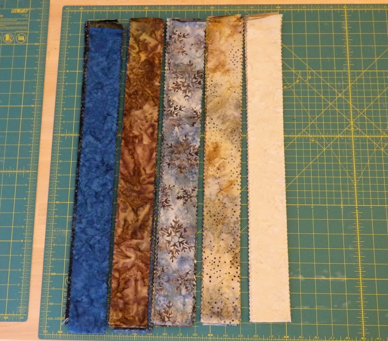


I took photos of my various arrangements and then converted the photos to black and white. The black and white photos clearly presented the value of the fabric colours so easily and so simply!
Here are some comparison photos:


Happy sewing!

Comments
Post a Comment